Climate change in The Netherlands between 1901 and 2022
Temperature, Precipitation and Snowfall in the Netherlands between 1901 and 2022
By Edward F. Hillenaar, MSc. in temperature
July 22, 2022
Introduction
There’s a slight temperature rise measured in the Netherlands between 1901 and 2022. Though the maximum temperatures near 37 degrees of Celsius were also measured respectively 15, 30, 50 and 60 years ago.
Source:1. Source: KNMI weather station De Bilt in The Netherlands (NLM00006260) 2. https://github.com/EdwardHill15/climate_viz
Data
Scraping weather data from the internet with R and the tidyverse (CC231)
Finding a Weather Station
Weather Station KNMI De Bilt The Netherlands
Get and tidy local weather station data (from: “NLE00100501”)
Statistical Analysis and plots
Figure 1: Maximum Temperature in The Netherlands between 1901 and 2022
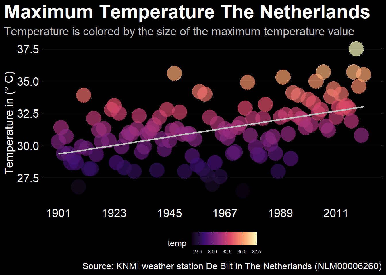
Figure 2: Mean Temperature in The Netherlands between 1901 and 2022
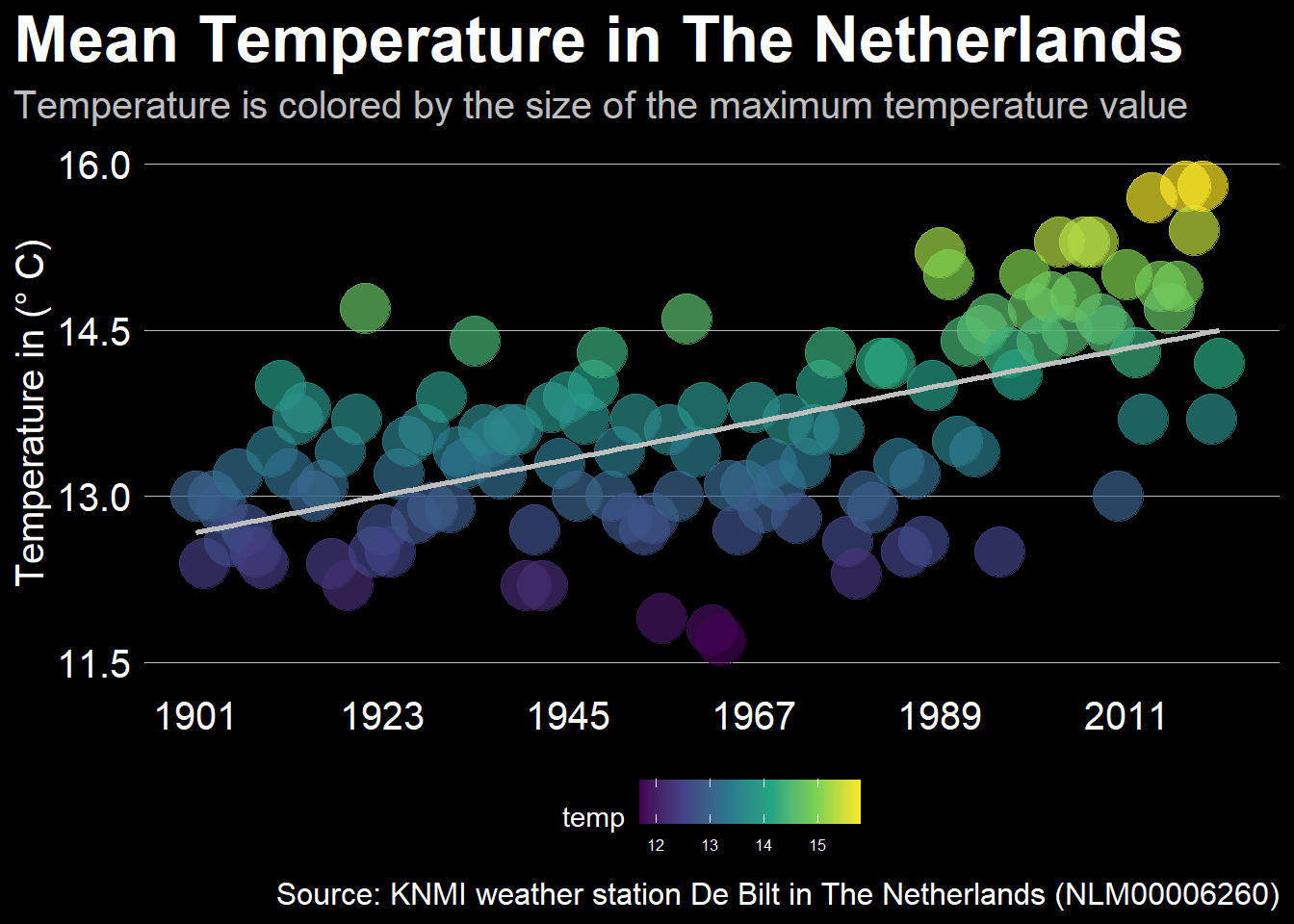
Figure 3: Precipitation in The Netherlands between 1901 and 2022
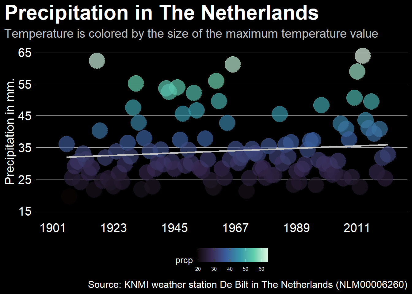
Figure 4: Through July 29th, the cumulative precipitation in The Netherlands
Sys.setlocale("LC_TIME", "English")## [1] "English_United States.1252"this_year <- year(today())
this_month <- month(today(), label = TRUE, abbr = FALSE)
this_day <- ordinal(day(today()))
local_weather <- df
colnames(local_weather) <- c("date", "tmax", "tmin", "prcp")
local_weather <- local_weather %>%
mutate(prcp_cm = prcp/10)
local_weather <- local_weather[-4]
colnames(local_weather) <- c("date", "tmax", "tmin", "prcp")
local_weather %>%
select(date, prcp) %>%
drop_na(prcp) %>%
mutate(year = year(date),
month = month(date),
day = day(date),
is_this_year = year == this_year) %>%
filter(!(month == 2 & day == 29)) %>%
group_by(year) %>%
mutate(cum_prcp = cumsum(prcp)) %>%
filter(cum_prcp > 0) %>%
ungroup() %>%
mutate(new_date = ymd(glue("2022-{month}-{day}"))) %>%
ggplot(aes(x=new_date, y=cum_prcp, group = year, color=is_this_year,
size = is_this_year)) +
geom_line(show.legend = FALSE) +
geom_smooth(aes(group = 1), color = "darkred", size = 0.5) +
scale_color_manual(breaks = c(F,T),
values = c("lightgray", "dodgerblue")) +
scale_size_manual(breaks = c(F,T),
values = c(0.3,1)) +
scale_x_date(date_labels = "%B", date_breaks = "2 months") +
scale_y_continuous(breaks = seq(0, 1200, 300),
labels = seq(0, 120, 30),
limits = c(0,1200),
expand = c(0,0)) +
labs(x = NULL,
y = "Cumulative precipitation (cm)",
title = glue("Through {this_month} {this_day}, the cumulative precipitation in The Netherlands near De Bilt is <span style = 'color: dodgerblue'>above</span> <span style = 'color: darkred'>average</span> for {this_year}")) +
theme(
plot.title.position = "plot",
plot.title = element_textbox_simple(margin=margin(b=10), size = 16, color = "white"),
axis.title.y = element_text(color = "white"),
panel.background = element_rect(fill = "black"),
axis.line = element_line(),
panel.grid = element_blank(),
plot.background = element_rect(fill = "black", color = "black"),
axis.text = element_text(color = "white", size = 8)
)## `geom_smooth()` using method = 'gam' and formula 'y ~ s(x, bs = "cs")'## Warning: Removed 17 rows containing non-finite values (stat_smooth).## Warning: Removed 17 row(s) containing missing values (geom_path).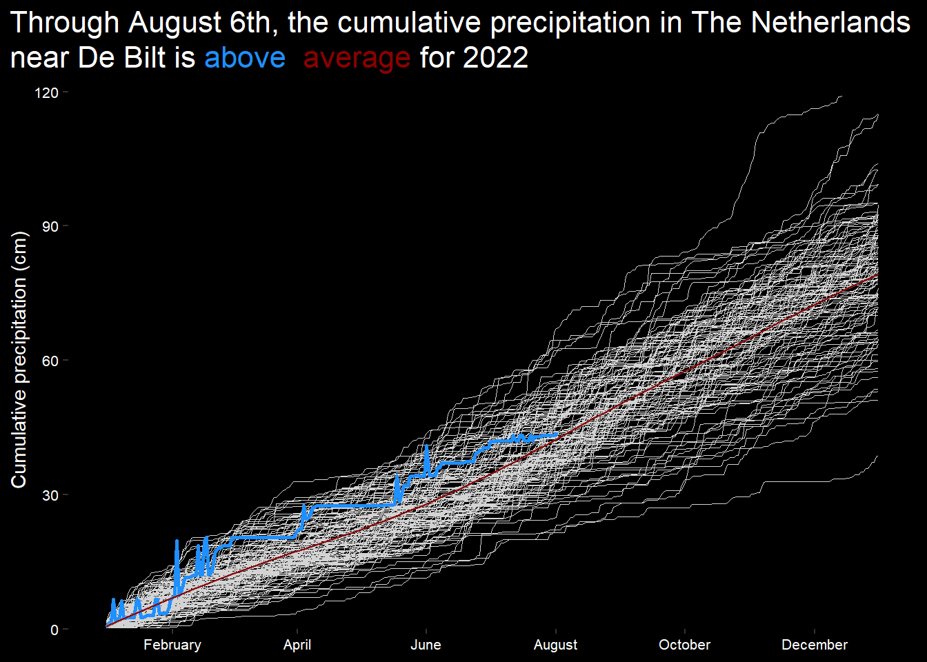
Snowfall in the Netherlands from 1955 to 2022
neerslaggeg_De_Bilt <- read_delim("neerslaggeg_De-Bilt.csv",
                                  delim = ";", escape_double = FALSE, trim_ws = TRUE)
## Rows: 45825 Columns: 4
## -- Column specification --------------------------------------------------------
## Delimiter: ";"
## dbl (4): STN, YYYYMMDD, RD, SX
##
## i Use `spec()` to retrieve the full column specification for this data.
## i Specify the column types or set `show_col_types = FALSE` to quiet this message.df <- neerslaggeg_De_Bilt
df <- df[-1]
colnames(df) <- c("date", "prcp", "snow")
df_snow <- df[-2]
df_snow$snow[df_snow$snow %in% c(996:999)] <- 1
df_snow <- df[-2]
df_snow$date <- as.character(df_snow$date)
df_snow$date <- ymd(df_snow$date)
df_snow[is.na(df_snow)] <- 0 # Vervang NA in data met 0
this_year <- year(today())
this_month <- month(today(), label = TRUE, abbr = FALSE)
this_day <- ordinal(day(today()))Graph of Snowfall in the Netherlands between 1955 to 2022
df_snow %>%
  mutate(year = year(date),
         month = month(date),
         day = day(date)) %>%
  filter(!(month == 2 & day == 29)) %>%
  group_by(year) %>%
  mutate(cum_snow = cumsum(snow)) %>%
  ungroup() %>%
  ggplot(aes(x=year, y=cum_snow, group = year, col = cum_snow)) +
  geom_line(size = 4) +
  scale_x_continuous(breaks = seq(1955, 2022, 5),
                     labels = seq(1955, 2022, 5),
                     limits = c(1948, 2022)) +
  scale_color_gradient2(low = "darkred", mid = "White", high = "red",
                       midpoint = 50) +
  scale_y_continuous(breaks = seq(0, 300, 50),
                     labels = seq(0, 300, 50),
                     limits = c(0,300),
                     expand = c(0,0)) +
  labs(x = NULL,
       y = "Cumulative snow (cm)",
       title = glue("Through June 20th, the <span style = 'color: red'>cumulative</span> <span style = 'color: lightblue'>snow</span> in The Netherlands near De Bilt to {this_year}")) +
  theme(
    plot.title.position = "plot",
    plot.title = element_textbox_simple(margin=margin(b=10), size = 16, color = "white"),
    axis.title.y = element_text(color = "white"),
    panel.background = element_rect(fill = "black"),
    axis.line = element_line(),
    panel.grid = element_blank(),
    plot.background = element_rect(fill = "black", color = "black"),
    axis.text = element_text(color = "white", size = 8),
    legend.background = element_rect(fill = "black"),
    legend.text = element_text(color = "white", size = 6),
    legend.title = element_text(color = "white"),
    legend.position = "bottom")
## Warning: Removed 38390 row(s) containing missing values (geom_path).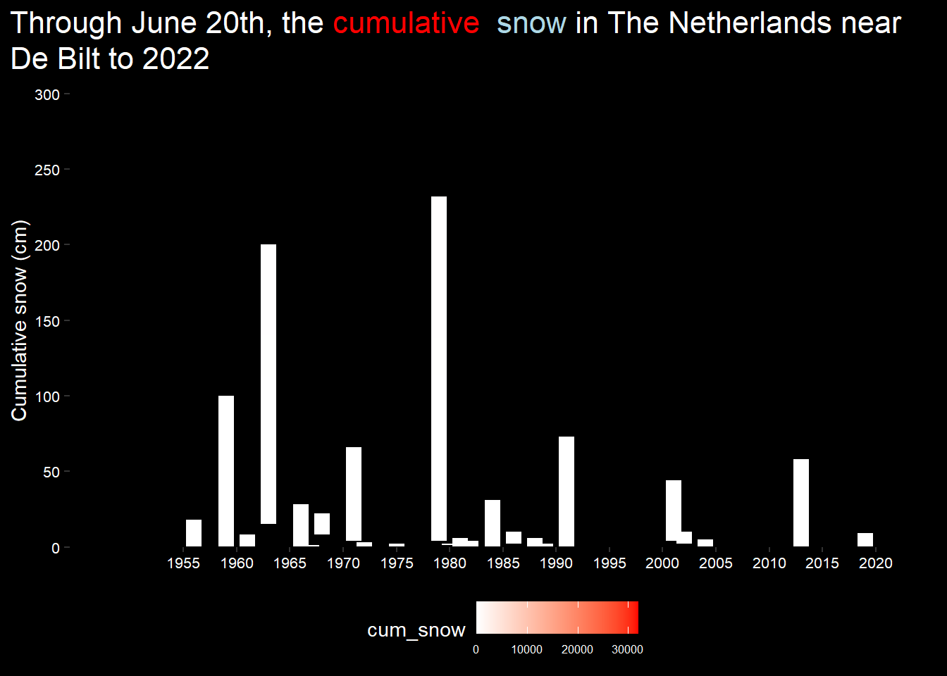
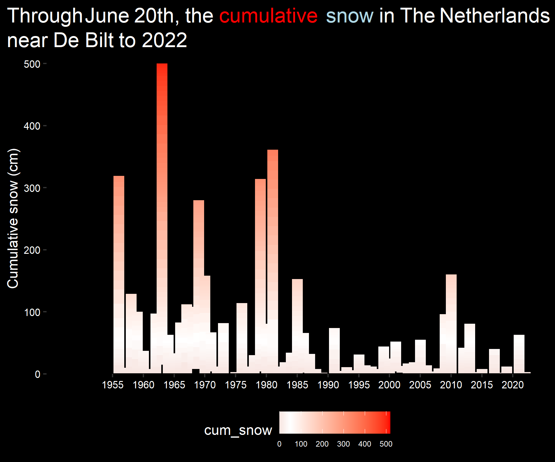
Graph of Snowfall in the Netherlands between 1955 to 2022
library(glue)
library(ggtext)
library(scales)
library(tidyverse)

pretty_labels <- c("prob_prcp" = "Probality of precipitation",
                  "mean_prcp" = "Average amount of\nprecipitation by day (mm)",
                  "mean_event" = "Average amount of\nprecipitation by event (mm)")

Sys.setlocale("LC_TIME", "English")
## [1] "English_United States.1252"today_month <- month(today())
today_day <- day(today())
today_date1 <- ymd(glue("2020-{today_month}-{today_day}"))
today_date <- ymd(glue("2022-{today_month}-{today_day}"))
local_weather %>%
select(date, prcp) %>%
mutate(day = day(date),
month = month(date),
year = year(date)) %>%
drop_na(prcp) %>%
group_by(month, day) %>%
summarize(prob_prcp = mean(prcp > 0),
mean_prcp = mean(prcp),
mean_event = mean(prcp[prcp > 0]),
.groups = "drop") %>%
mutate(date = ymd(glue("2020-{month}-{day}"))) %>%
select(-month, -day) %>%
pivot_longer(cols = c(prob_prcp, mean_prcp, mean_event)) %>%
mutate(name = factor(name, levels = c("prob_prcp", "mean_prcp", "mean_event"))) %>%
ggplot(aes(x=date, y=value, color = name)) +
geom_vline(xintercept = today_date, color = "red", size = 1) +
geom_line() +
geom_hline(yintercept = 0, color = "white") +
geom_smooth(se = FALSE) +
facet_wrap(~name, ncol = 1, scales = "free_y",
strip.position = "left",
labeller = labeller(name = pretty_labels)) +
scale_color_manual(values = c("red", "green", "dodgerblue")) +
scale_y_continuous(limits = c(0,NA), expand = c(0,0)) +
scale_x_date(date_breaks = "2 months",
date_labels = "%B") +
coord_cartesian(clip = "off") +
labs(x=NULL,
y=NULL,
title = glue("<span style = 'color: pink'>Probability</span>, <span style = 'color: green'>day average precipitation</span> and <span style = 'color: dodgerblue'>event average precipitation</span>\nin The Netherlands from 1901 - {this_year}"),
#title = glue("Through {today_month} {today_day}, the precipitation in The Netherlands near De Bilt has a <span style = 'color: red'>probability</span> and <span style = 'color: red'>average</span> for {today_date}")) +
subtitle = glue("The <span style = 'color: red'>red vertical line</span> is today {today_date}"),
caption = "Source data: https://github.com/EdwardHill15/climate_viz") +
theme(
panel.background = element_rect(fill = "black"),
strip.placement = "outside",
strip.background = element_blank(),
strip.text = element_text(color = "white", size = 12),
panel.grid = element_blank(),
plot.background = element_rect(fill = "black", color = "black"),
axis.line = element_line(),
plot.title.position = "plot",
plot.title = element_textbox_simple(margin=margin(b=10), size = 25, color = "white"),
plot.subtitle = element_textbox_simple(margin=margin(b=10), size = 15, color = "white"),
axis.title.y = element_text(color = "white"),
axis.text = element_text(color = "white", size = 12),
legend.background = element_rect(fill = "black"),
#legend.text = element_text(color = "white", size = 10),
#legend.title = element_text(color = "white"),
legend.position = "none",
#legend.key = element_rect(fill = "black")
)## `geom_smooth()` using method = 'loess' and formula 'y ~ x'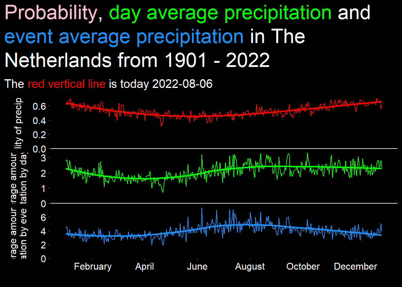

Precipitation in The Netherlands from 1901 - 2022
Conclusion
My conclusion based on these data is that there is light positive trend of temperature rise from 1901 to 2022 with a precipitation value slightly above the average precipitation but this doesn’t support the idea of a climate-crisis based on measured temperature differences.